Empowering every journey: UrbanThings’ Inclusive Mobility Innovations
At UrbanThings, our mission is to make travel simple for everyone. This is why we are dedicated to creating solutions that cater to everyone, including those with impaired vision or mobility challenges. This commitment to accessibility is evident in every step of our development process, from conceptual design to final deployment, ensuring a seamless and accessible journey for all passengers.
Accessibility-led design: the foundation of our process
At UrbanThings, accessibility is not an afterthought; it’s a core principle embedded in our design philosophy.
Our design principles are rooted in Material Design, emphasising a clean layout and intuitive interfaces. Key considerations include:
- High Contrast Ratios: Ensuring text and interface elements are easily distinguishable.
- Simplified Language: Displaying text in simple English to accommodate younger or less experienced readers.
- Screen Reader Support: Facilitating the use of assistive technologies for visually impaired users.
- Streamlined User Flows: Minimising complexity to enhance user experience for all.
UrbanThings’ latest app update introduces several accessibility-focused improvements aimed at providing an equal user experience for all passengers, particularly those relying on screen readers and other assistive technologies. Key features include:
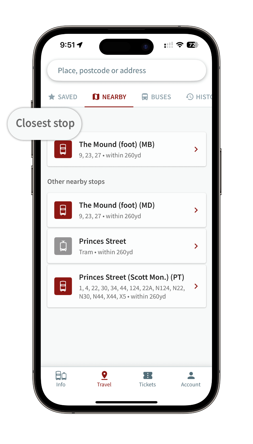
- Adaptive Behaviour Flows: Offering a ‘List’ view instead of a ‘Map’ view to present information more clearly.
- Descriptive Language for Controls: Using natural language to describe controls and features, such as arrival times of approaching vehicles.
- Streamlined Interfaces: Hiding non-essential elements from screen readers to avoid clutter and confusion.
Accessible journey planning with SkedGo
Our journey planning partner, SkedGo, champions inclusivity through its preference-based routing. This approach allows users to input specific mobility needs, ensuring that journey plans are relevant and practical. Key features include:
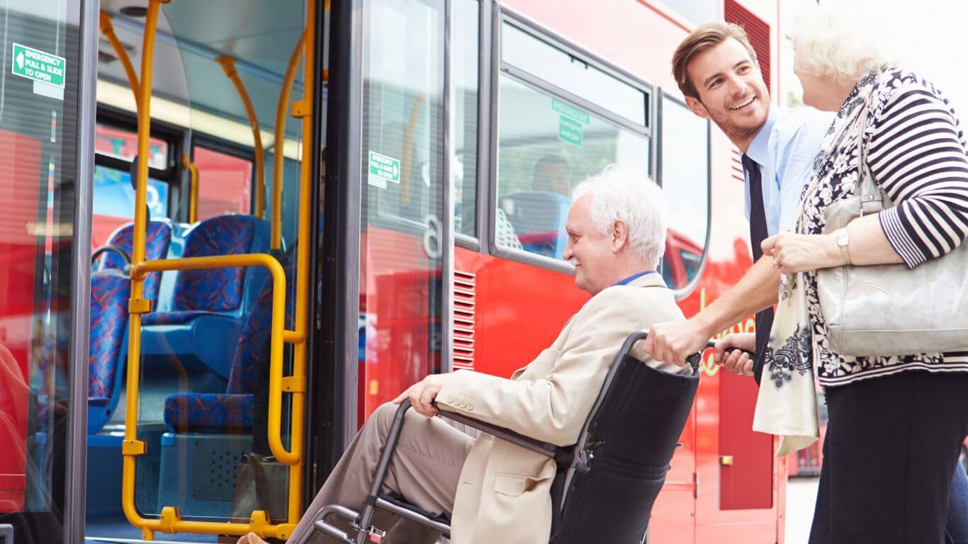
- Lift Availability Integration: Providing real-time updates on lift status to prevent travel disruptions for wheelchair users.
- Footpath Friendliness: Offering detailed information on the accessibility of paths, presented in both text and map formats.
These features significantly reduce the frustration and uncertainty often faced by passengers with mobility challenges, enhancing their overall travel experience.
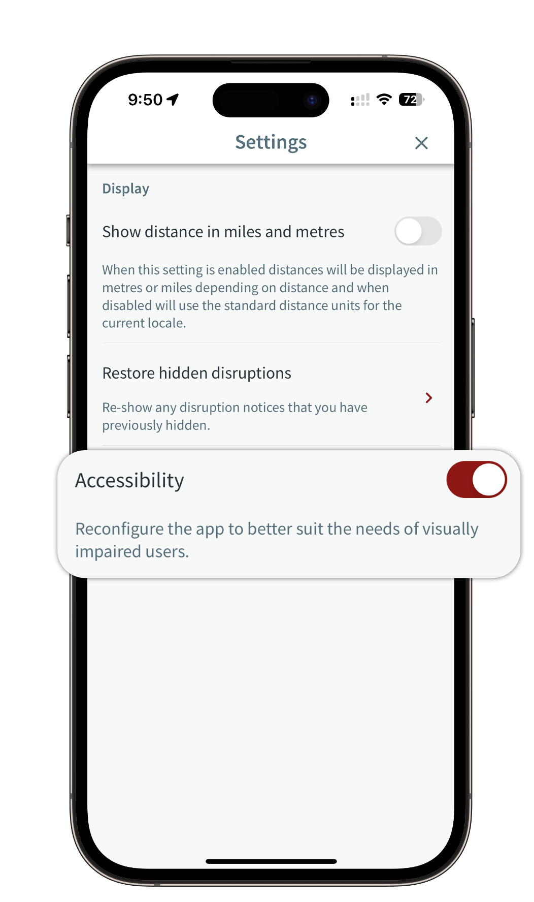
To further support visually impaired passengers, our app now includes an Accessibility Mode, which can be toggled on or off within the settings. Preferences sync across devices, ensuring a consistent user experience. Accessibility Mode prioritises text-based interfaces, optimising usability for screen readers and emphasising text-based search functionalities over visual elements.
UrbanThings is dedicated to creating an inclusive public transport system that serves all passengers, regardless of their accessibility needs. Our collaboration with industry-focused groups emphasises Material Design principles, and our partnership with SkedGo underscores our commitment to accessibility. By integrating these features into our apps, we not only comply with standards but also enhance the travel experience for visually impaired individuals and those with mobility challenges.
For UK bus operators and local authorities, adopting our accessibility-focused solutions means providing a better, more inclusive service to the community. Together, we can ensure that public transport is accessible, reliable, and user-friendly for everyone.
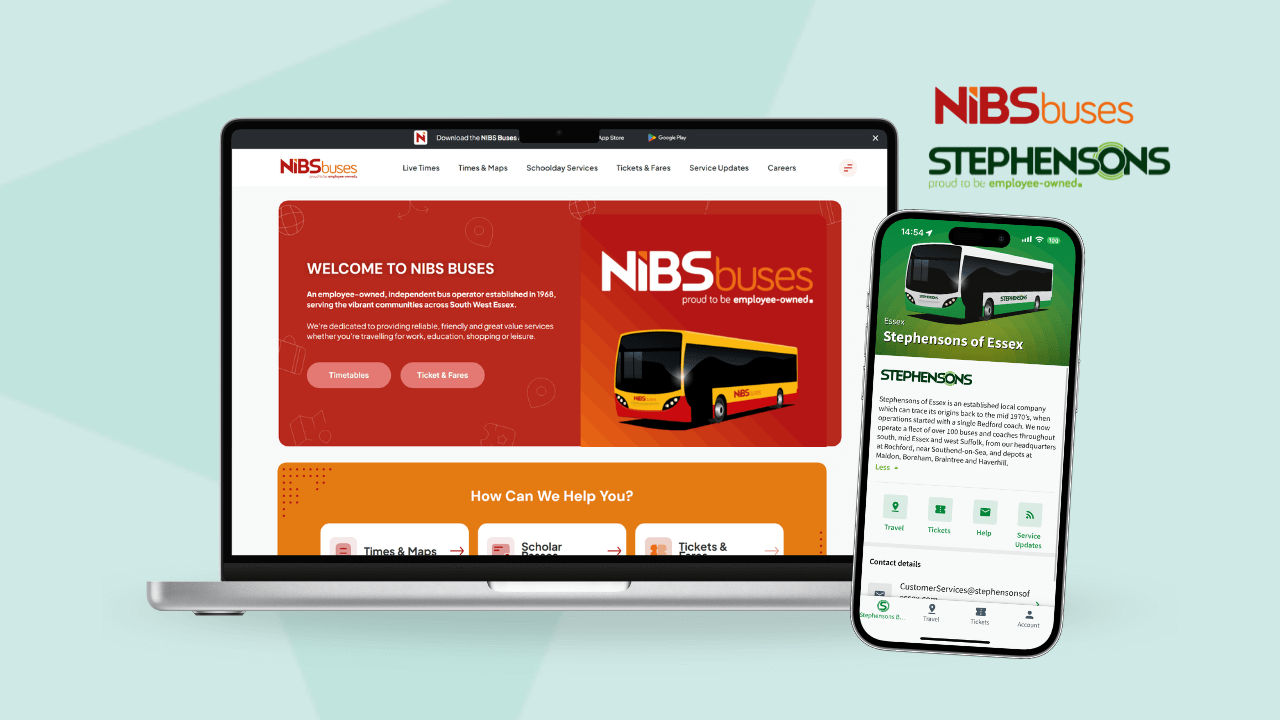
Our latest enhancements are already live in our passengers apps. If you’re interested in having your own branded mobile app equipped with these features, please feel free to reach out to us. We’re dedicated to helping cities and operators revolutionise passenger engagement.