What’s New: September update
New design, quicker access to favourite stops, and simplified journey planning
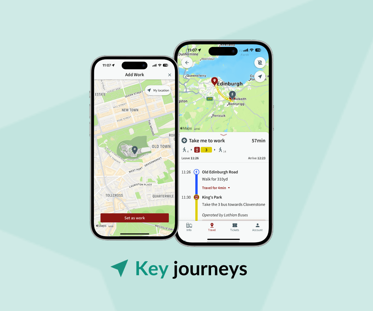
At UrbanThings, we’re working hard to help operators and cities attract new passengers and drive behaviour change. After a busy September and some user testing sessions in our London office, we’re excited to introduce new features, including a brand new design of the “Travel screen”, quicker access to “Saved stops” and simpler journey planning filters.
New design of the Travel page
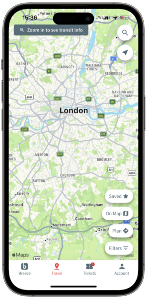
Check out the new design of the Travel page. Planning a journey, viewing all stops or saved stops, or filtering what you see on the map is all accessible from the same page. No need to navigate further, all the buttons are easy to access and do not hide the map.
Saved stops are easier to see with gold stars
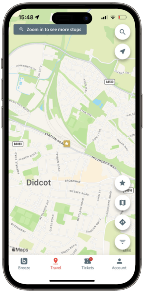
Running late? Seeing where your favourite stops are on the map is easy. We have added gold stars to mark your Saved Stops, so that you can click on them without browsing the map.
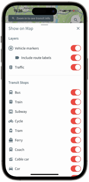
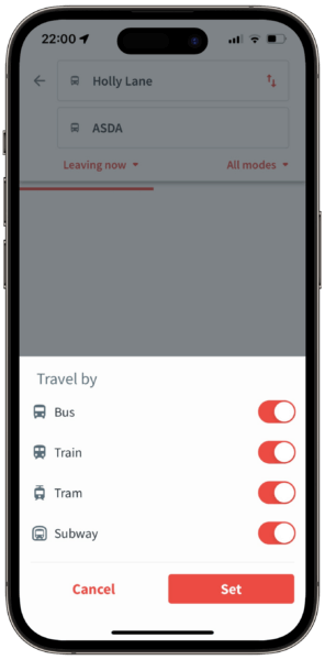
Improved journey mode filters
You can choose your favourite transport mode when planning a journey. We have upgraded the journey mode filters – to choose your preferred journey mode, simply select the filters you want.
Quicker access to saved stops
“Saved Stops” and “Nearby Places” are easier to access. Whether you’re planning a journey from the Search bar, or the Journey Planner, your saved stops will already be visible. No need to type anymore!
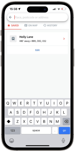
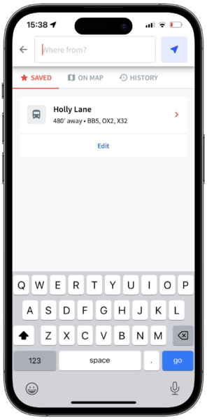
We are passionate about helping cities and operators deliver an efficient, effortless, and sustainable passenger experience. If you would like your own branded transport app, contact us via the form below and our team will be happy to help.
