Travel Planning Made Easier with Route Colours

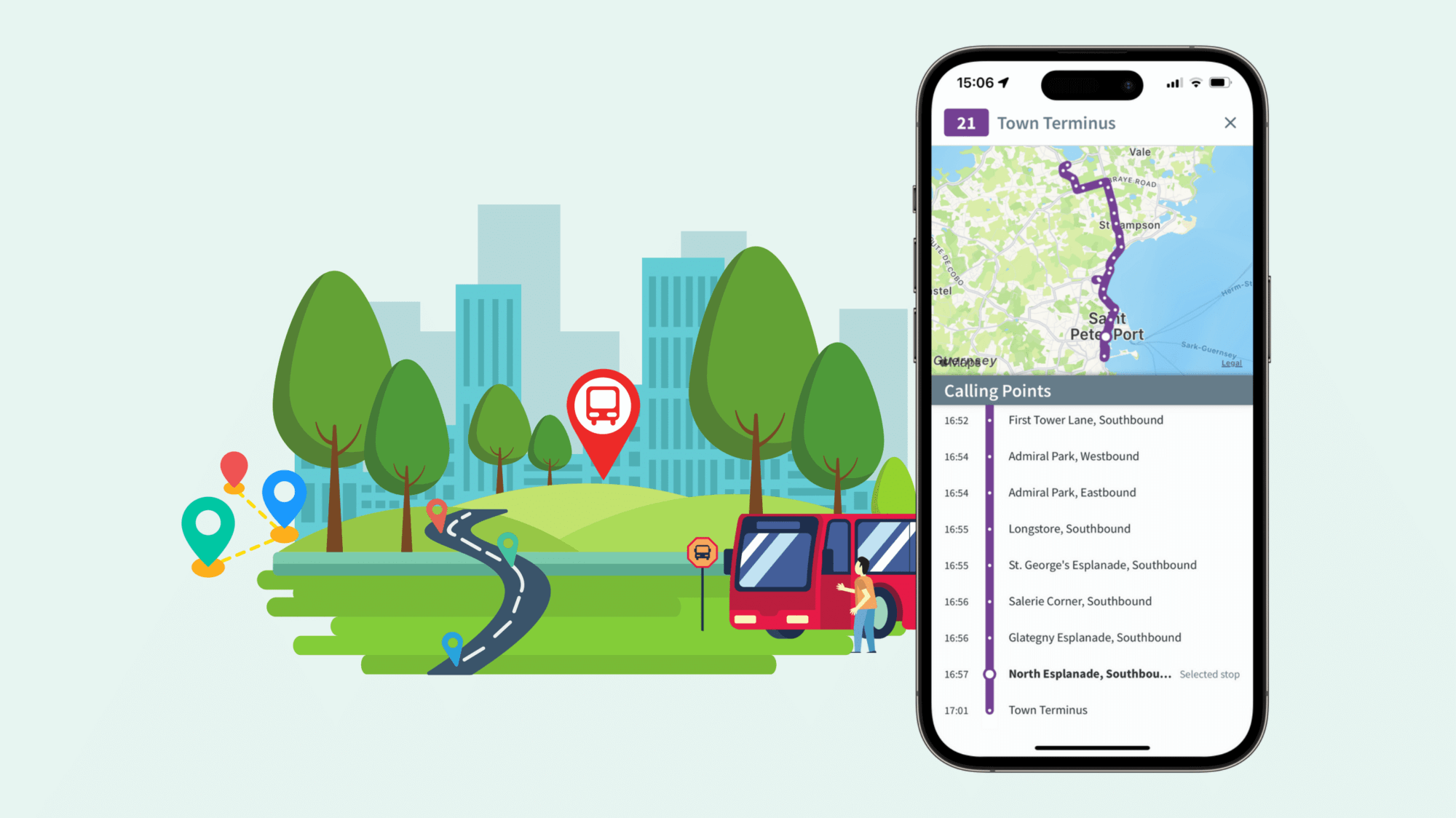
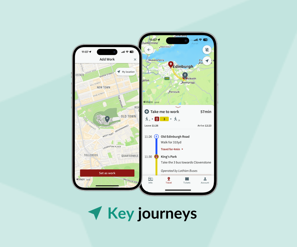
We’re excited to unveil Route Colours on the map as part of our latest update to UrbanHub. This change will empower passengers to effortlessly navigate the journey planner and spot crucial information on the screen.
When provided by the operator, route colours can be visible on:
- Live vehicle markers
- Filters on stopboards
- Calling point for a vehicle
- Route map lines
Simon Franklin, Senior Product Manager at UrbanThings says: “Route colours play a crucial role in simplifying navigation, fostering effective communication and promoting brand recognition. We are delighted to be able to put our customers’ colours at the forefront of our app experience and eventually, encourage passengers to use shared transport more frequently.”
With greater visibility of route colours within the app, passengers will easily recognise their preferred bus routes at a glance, making travel planning easier.
As for operators, integrating colours will contribute to the visual identity of the brand. Consistent use of colours across different channels, including maps, signages, and mobile apps will play a key role in establishing a strong brand identity and eventually, attract more users.
Finally, from an accessibility standpoint, colours can serve as non-verbal communication, aiding in memory recall and benefiting passengers who rely on visual information. With UrbanThings’ ongoing focus on making travel simple for everyone, the feature was implemented after considering customers’ feedback, recognising route colours as a crucial reference point for passengers.
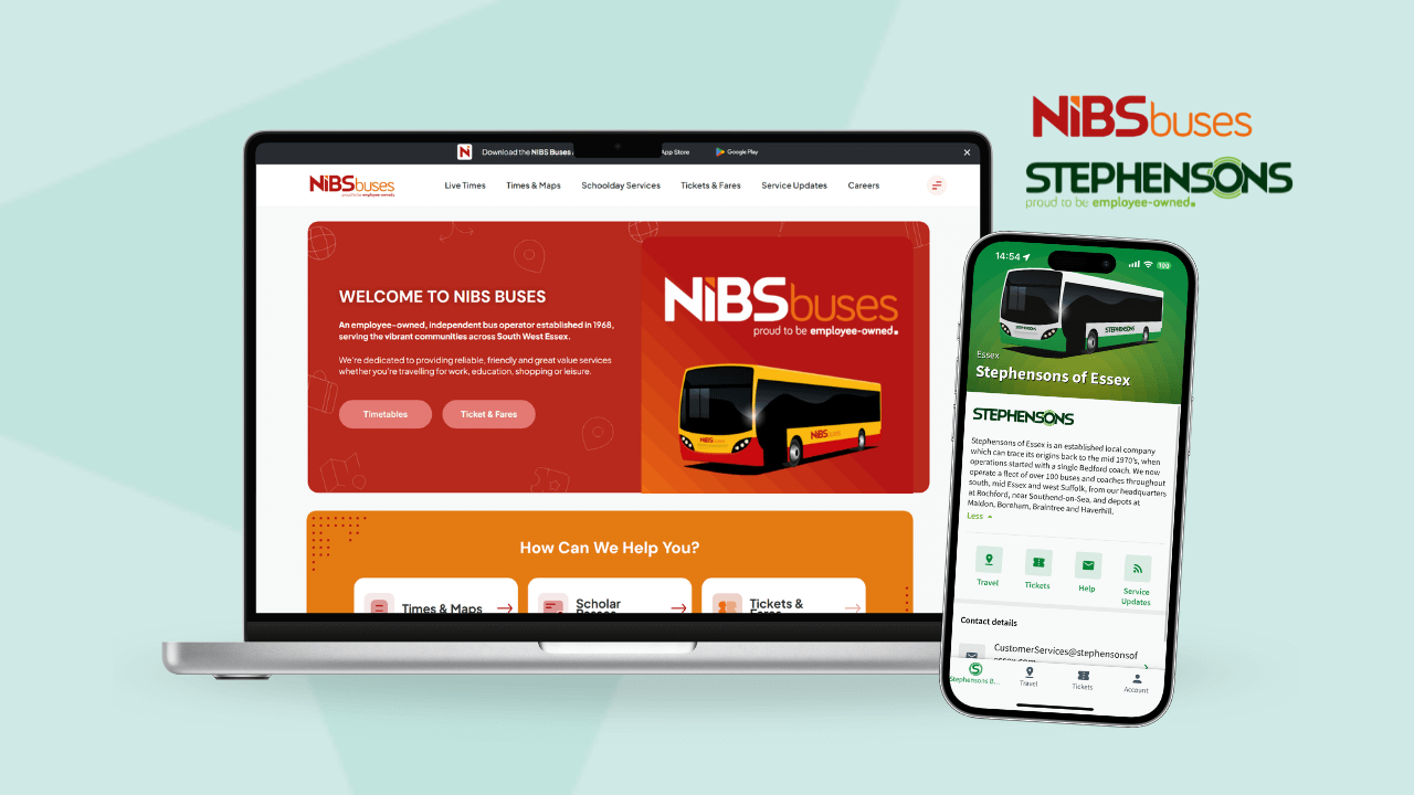
Our recent changes are already available in our passenger apps. We’re passionate about helping cities and operators improve their passenger experience. If you would like your own branded app, contact us and we will be in touch soon.

